Create Visualization
- 12 Apr 2023
- 1 Minute to read
- Print
- DarkLight
- PDF
Create Visualization
- Updated on 12 Apr 2023
- 1 Minute to read
- Print
- DarkLight
- PDF
Article summary
Did you find this summary helpful?
Thank you for your feedback
Visualizations display aggregate data in a variety of options. Following includes examples on setting up some data presentations.
To access visualization functions:
- Go to APPS :: NODEGRID DATA LAKE :: EXPLORER.
- Click the Hamburger icon (left side) to display the drop-down menu. On the drop-down, click Visualize.
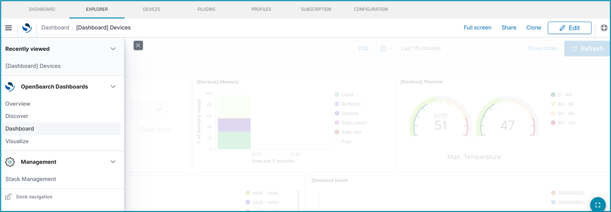
- This displays the Visualizations panel (lists table of current visualizations). The Pencil icon (right side) opens the Edit panel.
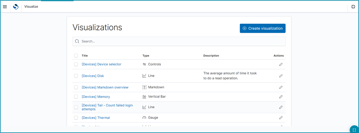
- To edit an existing visualization, click the Pencil icon (Actions column), edit details, and update.
- To create a new visualization, click Create Visualization (displays dialog).
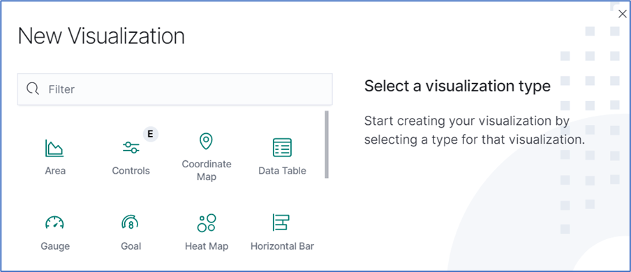
- Click the visualization to be created. On the dialog, enter specifications and details.
- When done, click Update. If there is an error, a red border displays around the error item. Fix the error and click Update.
- If needed, click Discard to abandon the process.


Line Charts
Line Charts visualize data points along a line graph.
Create a Single or Multi-Line Chart (Configuration Example)
- On the Visualization panel, click Create visualization (displays dialog).
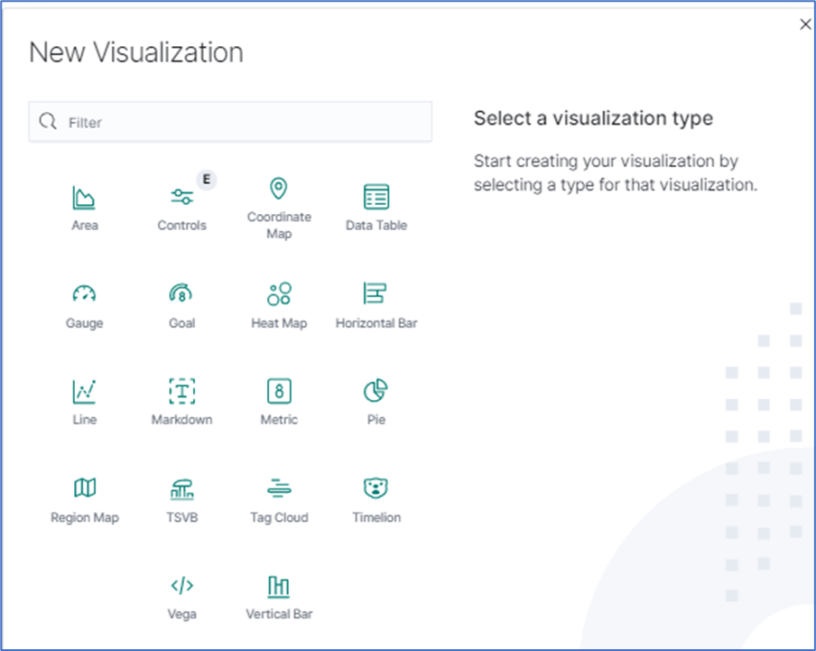
- Click the Line icon (displays dialog).
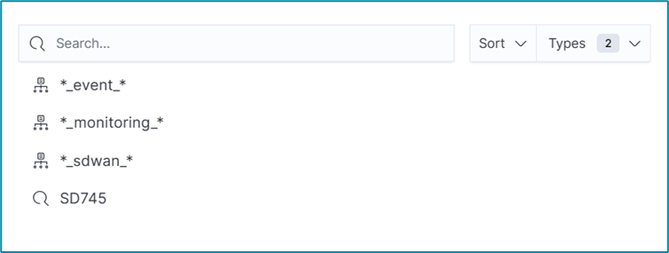
- On the dialog, click *_monitoring_* (displays dialog).
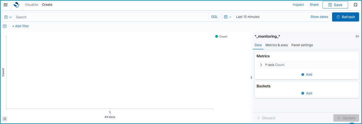
- To select the data points to visualize, enter a search expression, and click Update.

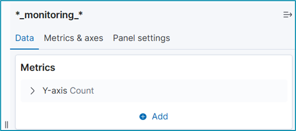
- In the Metrics section, click Y-Axis arrow.
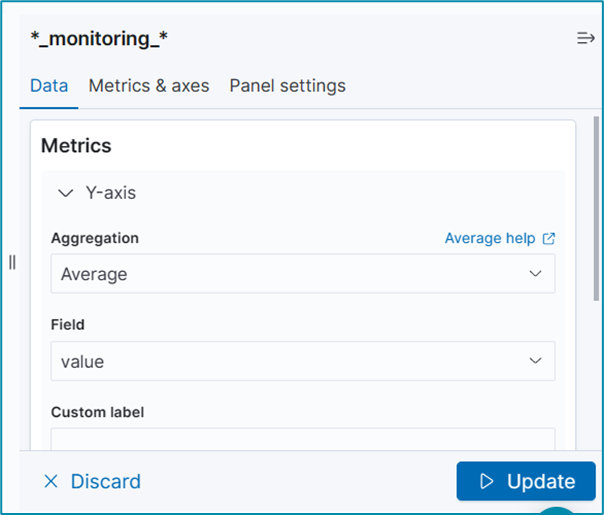
- On the Aggregation drop-down, under Metric Aggregations section, select Average . In Field drop-down, select value. Click Update.
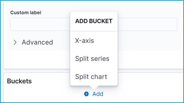
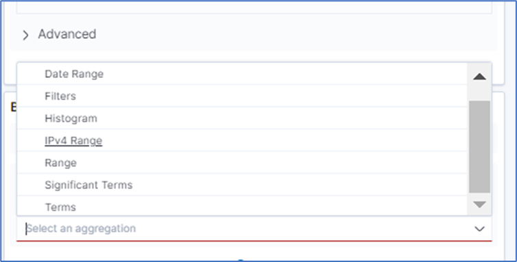
- In Buckets section, click Add. On ADD BUCKET dialog, click X-axis.
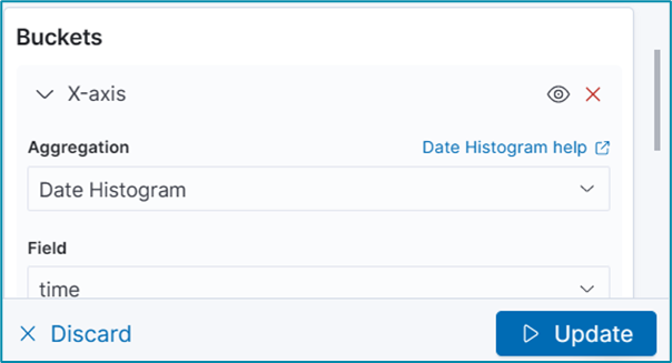
- On Aggregation drop-down, select Date Histogram. Accept Field and Interval defaults. Click Update.
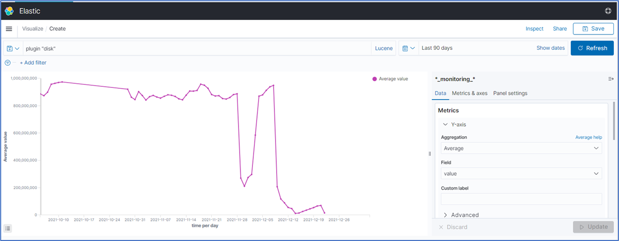
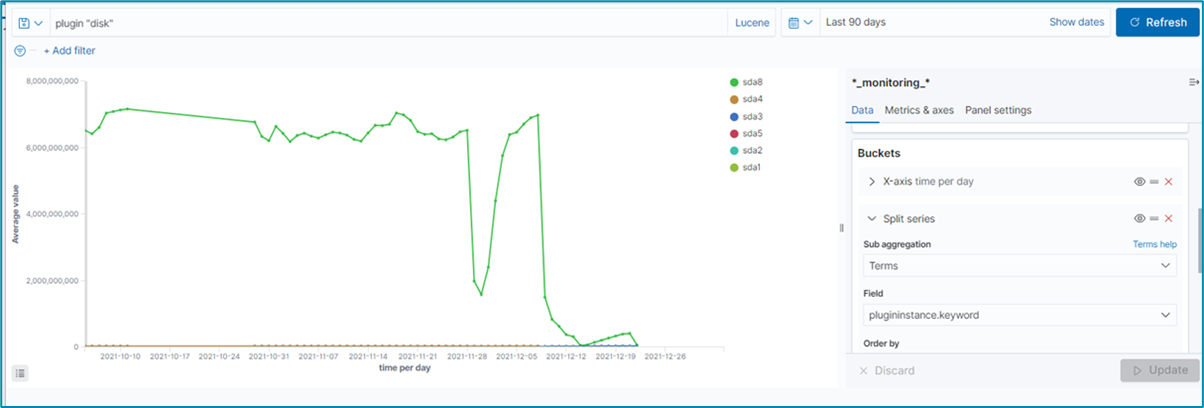
- Example graph is displayed.
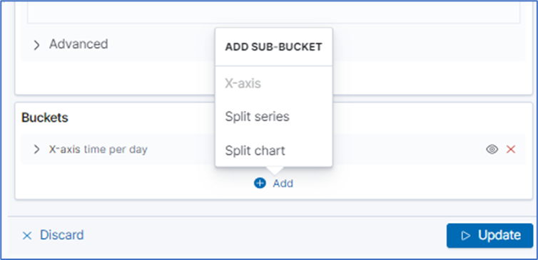
- To split the values on individual lines, on Buckets, click Add. On ADD SUB-BUCKET dialog, click Split series.
- On the sub-aggregation drop-down, select Terms.
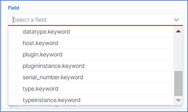
- On Field drop-down, select the item tplugininstance.keyword.
- Click Update (graph shows the split aggregation).
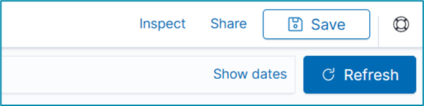
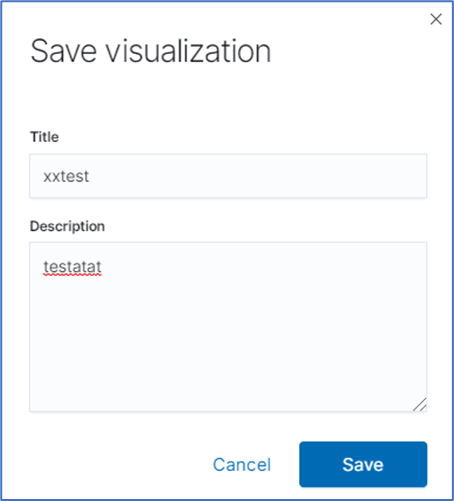
- On the Toolbar, click Save (upper right corner).
- On the Save visualization dialog, enter a Title and Description. Click Save.


Was this article helpful?