Line Charts allow the visualization of data points along the line graph.
Create a Single or Multi-Line Chart (Configuration Example)
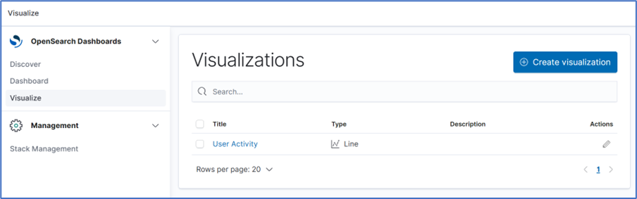
- Go to Dashboard :: Visualize.
- On the Visualize side-tab, click Create Visualization,
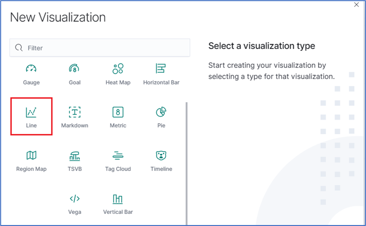
- Click the New Visualization dialog, click the Line icon.
- On the dialog, click logstash-*.
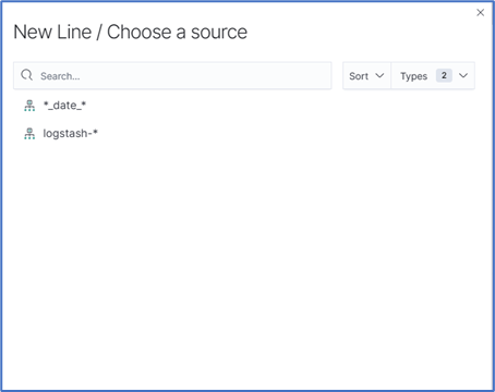
- In the From a New Search, Select Index menu, click logstash-* (displays editor dialog).
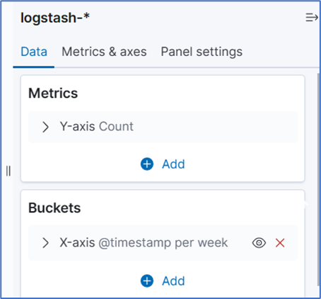
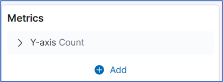
- In the Metrics section, expand the Y-Axis arrow.
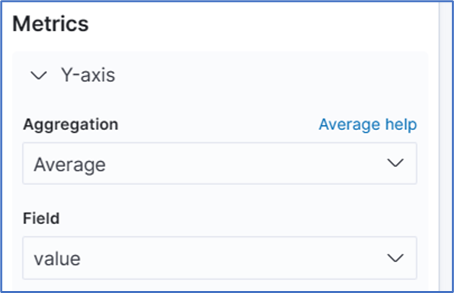
- On the Aggregation drop-down, under Metric Aggregations section, select Average . In Field drop-down, select value.
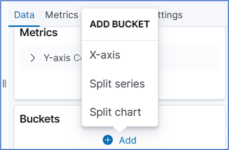
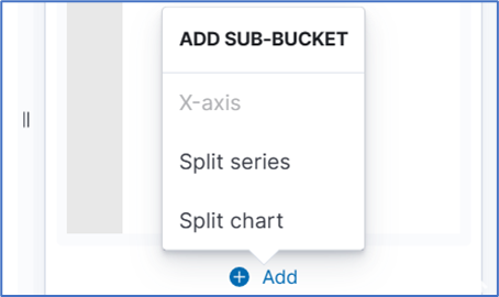
- In buckets section, click Add, and click X-Axis.
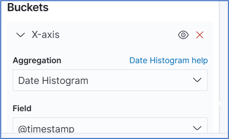
- On Aggregation drop-down, select Date Histogram. Accept Field and Interval defaults.
- On the Toolbar, click Save.
- Enter a name for the visualization and click Save.
Create a Multi-Line Chart (Configuration Example)
Follow the Single-Line Chart example and continue these steps.
- Below Custom Label field, click +Add. On the Add Sub-Bucket pop-up select Split Series.
- On Sub Aggregation drop-down, click Filters.
- In Filter 1, enter a search expression for the elements to visualize.
- (optional) To associate a label, click the Settings icon and enter Filter 1 label.
- (as needed) Click Add Filter and repeat.
- (as needed) Click Add sub-buckets and repeat.
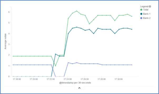
- To refresh the graph, click Refresh. The graph example includes several sub-buckets.
- On the Toolbar, click Save (displays dialog).
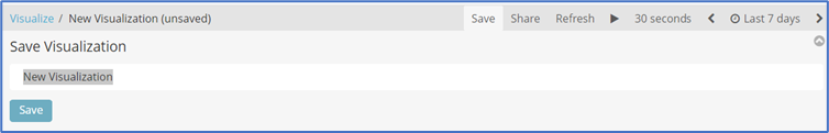
- Enter a name for the visualization and click Save.