Create an Area Chart (Configuration Example)
The area chart is useful for stacking measurements for different but related entities.
NOTE
Become familiar with the Line Chart procedure before creating an Area Chart.
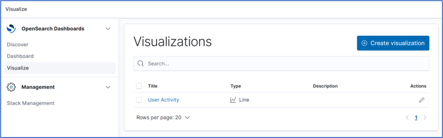
- Go to Dashboard :: Visualize.
- On the Visualize side-tab, click Create Visualization,
- Click the New Visualization dialog, click the Line icon.
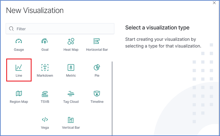
- Click the Area icon. On the dialog, click logstash-*.
- In metrics section, click on Y-Axis icon. In Aggregation drop-down, select Sum.
- On Buckets menu, X-Axis, on Aggregation pop-up, select Data Histogram. In Interval drop-down, select Custom then enter value (i.e., 30s).
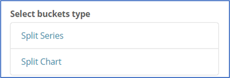
- Click Add Filter and click Add sub-buckets.
- On the Select buckets type menu, click Split Series.
- On Sub Aggregation drop-down, select Filters. In Filter 1, enter value. Click Add Filter.
- In Filter 2, enter a search expression for the elements to visualize.
- (as needed) Click Add Filter and repeat.
- To refresh the graph based on the configuration, click Refresh.
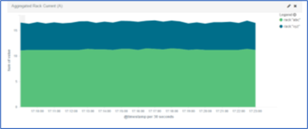
- The resulting visualization would look similar to this:
- On the Toolbar, click Save. Enter a name for the visualization and click Save.
NOTE
When using area charts, be careful to not use the same measurement twice.